Dashboard Details
Overview
The Dashboard Details page is used to view and edit dashboard content. It supports two modes: View Mode (read-only) and Edit Mode (visual editing).
Mode Switching
The Dashboard Details page opens in View Mode by default. Click the "Edit" button in the top toolbar to switch to Edit Mode, and click "Exit Edit" to return to View Mode. If there are unsaved changes when switching, the system will prompt for confirmation.
View Mode Features
Dashboard Display
In View Mode, the dashboard displays the following:
- Layout: All widgets displayed according to the saved layout
- Data: Real-time data fetched from data sources
- Charts: Visual content such as charts and tables
- Title: Dashboard title
Interactive Features
Some widgets in View Mode support the following interactions:
- Data Tooltips: Hover to display data details
- Legend Filtering: Click chart legends to show or hide corresponding data series (e.g., pie charts, donut charts)
- Refresh: Click the more actions button on the widget card and select "Refresh" to re-fetch data for that widget
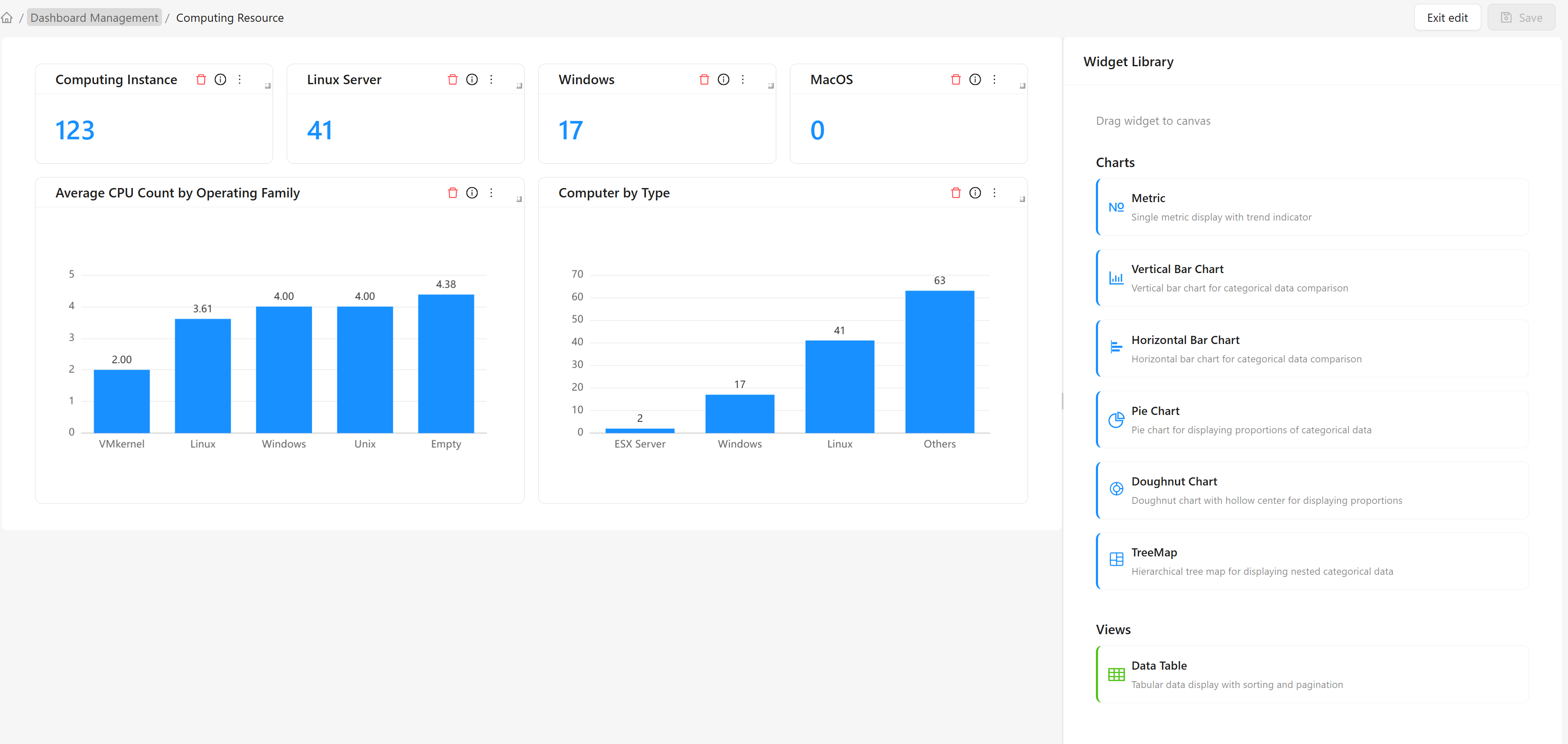
Edit Mode Features
Dashboard Editor
In Edit Mode, the dashboard editor provides the following features:
Canvas Area
The canvas is the main editing area of the dashboard:
- Drag-and-Drop Layout: Drag widgets to adjust positions
- Resize: Drag borders to adjust widget size
- Grid Alignment: Automatically align to the grid for easy layout
Component Library
The component library contains available widget types:
Chart Types:
| Widget | Description |
|---|---|
| Metric Card | Single value display with trend indicator support |
| Bar Chart | Vertical bar chart, suitable for categorical data comparison |
| Horizontal Bar Chart | Horizontal bar chart, suitable for categorical data comparison |
| Pie Chart | Pie chart, suitable for showing proportions of categorical data |
| Donut Chart | Donut chart, a pie chart with a hollow center |
| Treemap | Hierarchical treemap, suitable for displaying nested categorical data |
View Types:
| Widget | Description |
|---|---|
| Data Table | Tabular data display with pagination support |
Widget Operations
Add a Widget
- Find the desired widget type in the component library
- Drag the widget to the canvas area
- Release the mouse to complete the addition
Component Settings Panel
When a widget is selected, the component settings panel is displayed on the right:
Top Form Fields:
- Widget Type: Select the widget type
- Name: Unique identifier for the widget
- Title: Display title for the widget
- Description: Description of the widget's purpose
Collapsible Panels:
- Data Source Settings: Configure data source, grouping, and aggregation
- Display Settings: Chart and data display style settings
Delete a Widget
- Select the widget you want to delete on the canvas
- Click the delete button in the upper-right corner of the widget card
- Confirm the deletion
Adjust Widget Position
- Select the widget you want to move on the canvas
- Drag the widget to the target position
- Release the mouse to complete the move
Adjust Widget Size
- Select the widget you want to resize on the canvas
- Drag the widget's border or corner
- Release the mouse when the desired size is reached
Data Source Settings
Data Source Types
The dashboard supports the following data source types:
CI Instances
Query CI instance data from the CMDB, supporting grouping and aggregation by type:
| Field | Description |
|---|---|
| CI Type | Select the CI type to query |
| Group By | Group results by field. Select "CI Type" to group by CI type, or specify an attribute name for custom grouping |
| Aggregation Function | Aggregation method applied to grouped data. Supports: Count, Average, Minimum, Maximum, Sum |
| Aggregation Attribute | When using Average, Minimum, Maximum, or Sum functions, specify the attribute to aggregate |
When the aggregation function is "Count", no aggregation attribute is needed. For other aggregation functions, an aggregation attribute must be specified.
CI and Relationship Models
Query the number of model definitions in the CMDB, grouped by type:
| Field | Description |
|---|---|
| CI and Relationship Models | Filter class definitions by type. Options: CI Types, Relationship Types, All |
Data Source Configuration Steps
- Select the widget to configure
- Expand "Data Source Settings" in the right component settings panel
- Select the data source type
- Configure the corresponding parameters based on the data source type
- Save the configuration
Save and Cancel
Save Dashboard
After modifying a dashboard, you need to save to persist the changes:
- Click the "Save" button in the top toolbar
- The system validates the dashboard configuration
- If validation passes, it is saved to the database
- A save success message is displayed
Exit Edit Mode
To discard unsaved changes:
- Click the "Exit Edit" button
- If there are unsaved changes, the system displays a confirmation dialog
- Click "OK" to discard changes and return to View Mode
- Click "Cancel" to return to continue editing
Common Scenarios
Scenario 1: Create a Computing Resources Dashboard
Business Need: Create a dashboard that displays an overview of computing resources.
Steps:
- Click the "Create Dashboard" button
- Fill in the basic information:
- Name: computer-overview
- Display Name: Computing Resources
- Description: Computing resources overview
- After entering the editor, add widgets:
- Add a metric card, data source "CI Instances", CI type "Computer", aggregation function "Count"
- Add a pie chart, data source "CI Instances", CI type "Computer", group by "OS Family", aggregation function "Count"
- Add a bar chart, data source "CI Instances", CI type "Computer", group by "Manufacturer", aggregation function "Average", aggregation attribute "CPU Count"
- Adjust the layout and save
Scenario 2: Clone and Modify an Existing Dashboard
Business Need: Create a variant based on an existing dashboard.
Steps:
- Select the dashboard you want to clone in the dashboard list
- Click the "Clone Dashboard" button
- Modify the cloned information and click "OK" to complete the cloning
- Open the cloned dashboard, switch to edit mode, modify, add, or remove widgets, then save after editing
Expected Result:
- An independent copy of the dashboard is created
- Modifying the cloned version does not affect the original dashboard